Branding for healthcare companies
Back in 2019, we were booking our first big branding project as a Studio, for a health related startup with big dreams. They asked me: “in your past experience designing for a healthcare company, what was your biggest challenge?”
What came to mind immediately, was to create a brand that looked all at once friendly and inviting, yet serious, and trustworthy. We’ve tackled that challenge several times since then, and I’ll summarize the creative ways we’ve been able to do so with specific examples.
For Bond Vet, we paired warm & inviting colors with an overall clean and minimal brand identity, which includes flat, friendly vector pet illustrations that seamlessly interact with the wavy backgrounds.
For Join Parachute, we’ve created a full library of illustrated characters, who feel authentic and approachable, conveying emotion. Their realistic and detailed features make the brand look reliable and serious.
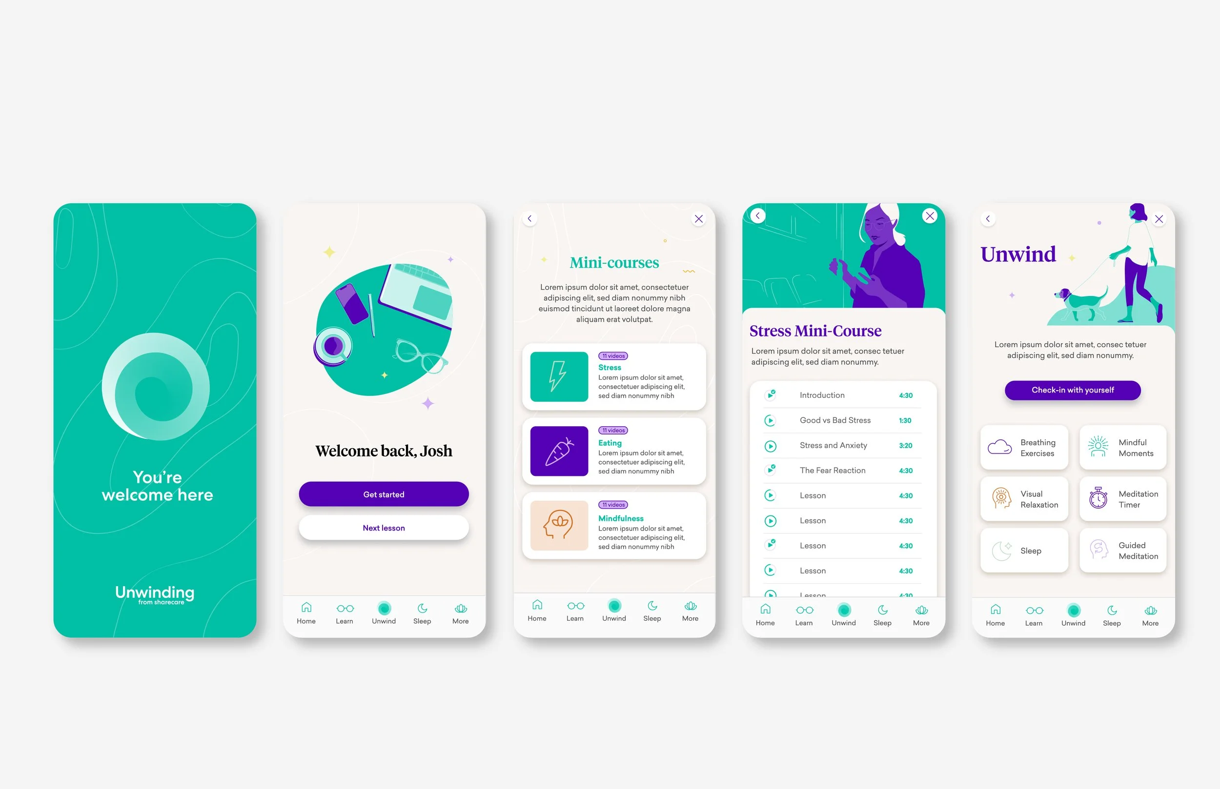
For a mental health app, the illustrations are minimalist and use negative space to keep the designs light and airy. The distinctive color palette help keep the branding memorable.
For Reside Health, we created an iconic logomark that suggests what the brand offers (health care right in your office building), paired with a sans-serif wordmark that’s effective and impactful.
As you can see, there are many ways to approach a similar challenge, because no two brands are the same. If you'd like to know more, don't hesitate to reach out!


