Is there a right way to pick a color palette?
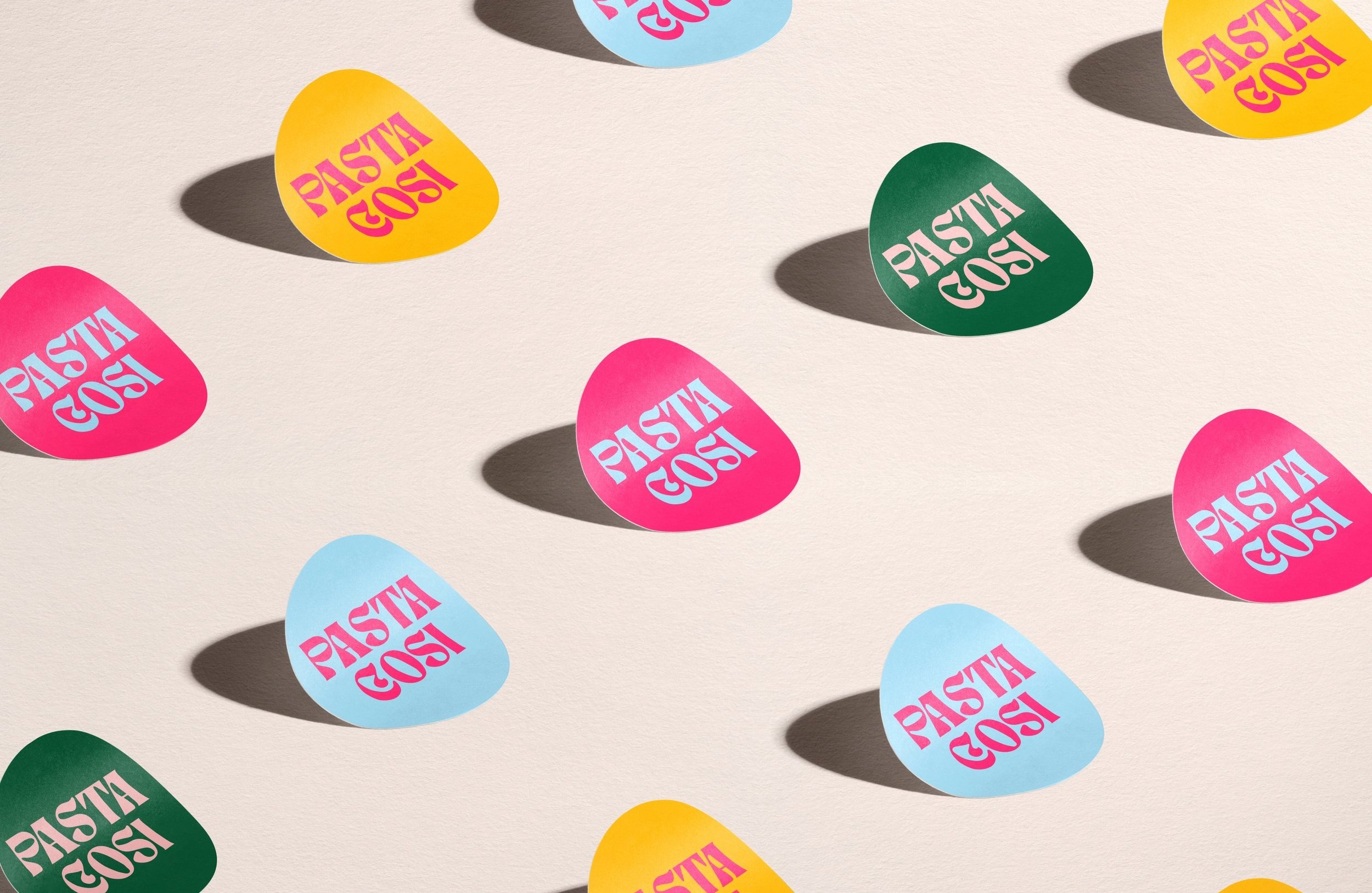
🎨 Color palettes are one of the core elements of a brand identity. It’s also one of the most controversial topics here at the studio. 🙃
As designers, we can be very indecisive about them. For clients, it’s one of the first aspects of the brand identity we’re presenting, so it leaves a strong impression, no matter how much they love the other elements.
So it’s sometimes tempting to get caught up in the data and science attached to colors. Are females aged 30-45 more attracted to blue or teal? Are men more likely to purchase a packaging that has purple details vs red?
I try to discourage our clients from thinking that way. First of all, there isn’t much conclusive research on such specific topics, though some common knowledge is generally agreed upon — which colors feel more relaxing, which ones are dynamic etc, (but more on that later). Another variable is that colors come within a palette. Blue associated with coral doesn’t feel the same way next to bright yellow, for example.
Additionally, when working on a a brand refresh, it's also important to keep in mind the background and story telling that has already been establish, as well as maintaining brand recognition.
Colors evoke feelings, and those feelings differ from person to person, depending on the experience associated with each color.But ultimately, colors really come to life when we see them as part of a system. For us, it’s a combination of logos, typefaces and graphic elements: in a holistic brand identity, colors can really come to life and speak to your audience.