Brand Illustration
In the past few years, brand illustration have seen their popularity rise to a point of near saturation. But fortunately, there are as many styles, colors and techniques as there are brands, and always a way to reinvent the wheel. As a creative studio, we’re never short of ideas to give your brand a unique, relatable illustration library.
Winning is a podcast based on real-life negotiation coaching sessions, where expert Wies Bratby guides a listener to succeed at their next salary negotiation. For their cover, we focused on a portrait of Wies. Using negative space, minimal details and a limited color palette — including a bright red, symbol of Wies’s confident and bold approach — we departed from the figurative style to make it look more intentional and personal.
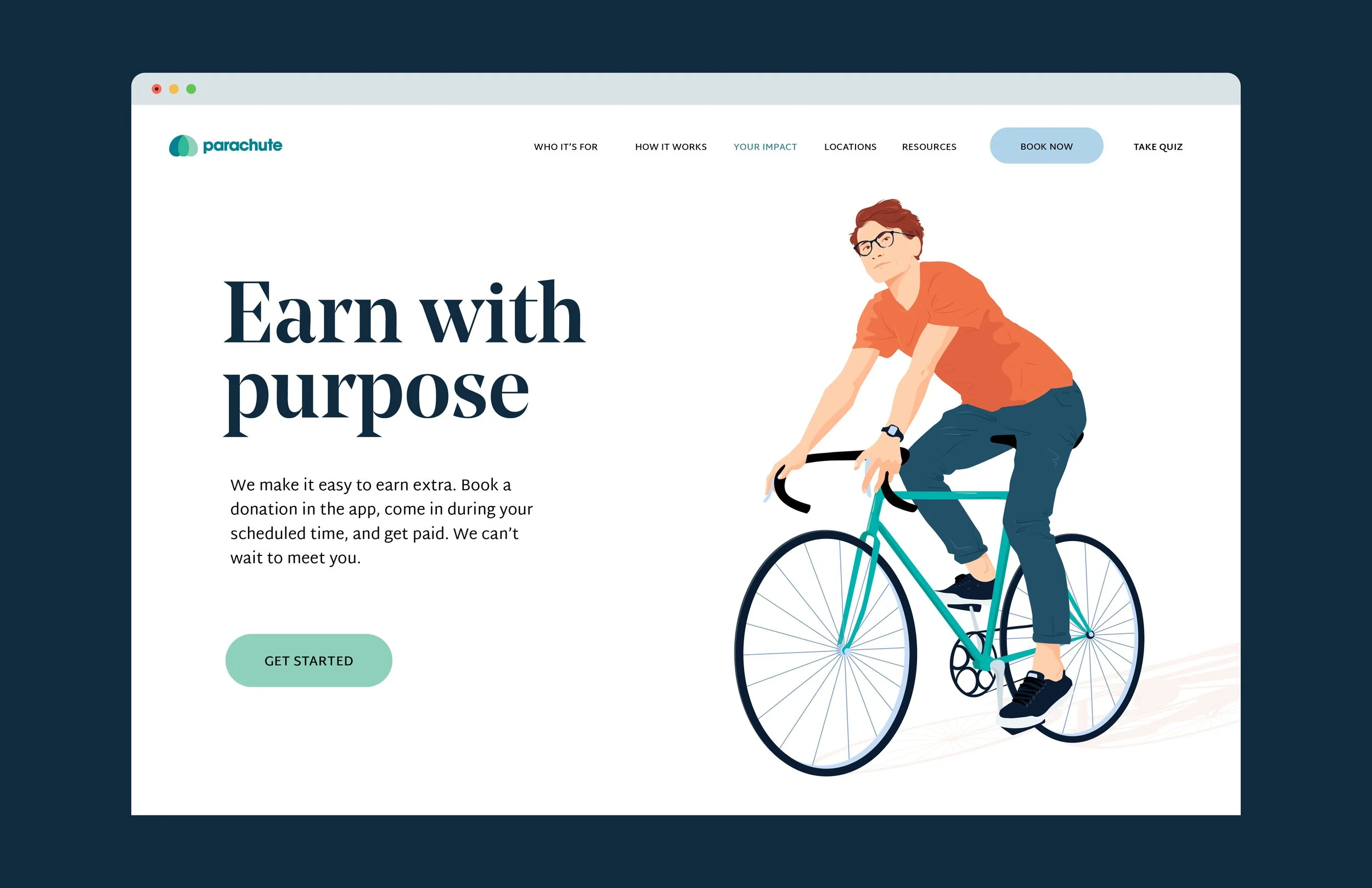
On the other hand, Join Parachute needed a full library of characters and objects that would feel multi-dimensional, approachable and visibly hand-drawn. So, we got back to our drawing tablets to design a dozen of characters who would show the diversity of Parachute’s audience, creating unique details for each – wanting to make sure to capture a range of skin colors, body shapes, styles, ages, and more. We even named them!
For Walmart InHome, the goal was to be descriptive, reassuring, warm and functional. We started with establishing the color palette – following Walmart’s guidelines, with enough range to depict different situations and create lights and shadows that didn’t feel too cold. From there, we had a few building blocks to make sure that every design looked like they came from the same place, and conveyed the brand’s goals.
These are just 3 examples of how we integrate illustration in a functional way, but we can’t wait to share more in the coming weeks!